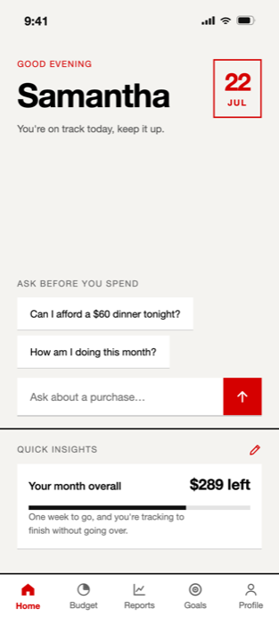
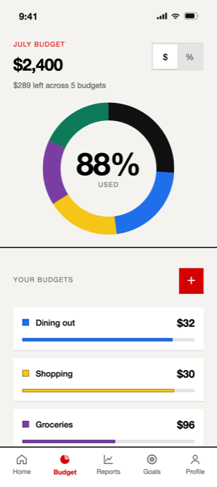
Most budgeting tools tell you what already happened — clean charts of money you already spent. Stack explores how a budgeting app can support the moment that actually matters: deciding whether to spend, before you do.
The design was shaped by testing: every friction point found across two rounds of moderated usability testing became a design change.
The problem
Budgeting apps are optimized for reporting, not decision-making
Reviewing existing budgeting tools, I noticed a consistent pattern: home screens focused on account balances, spending history, category breakdowns, and financial summaries.
All of that is useful for understanding what has already happened — and almost none of it helps in the moment someone is deciding whether a purchase fits within their budget.
The opportunity
Most people budget in their heads
In a survey of 21 participants, 62% said they mentally estimate affordability before making an unplanned purchase rather than checking a budgeting tool or their bank account.
Asked what information would actually help in that moment, respondents consistently named the same three: their remaining category budget, how much they'd already spent, and whether they were still on track overall.
The opportunity wasn't providing more reports. It was helping users understand where they stood before spending.
Design response
Turn budget data into decision support
Rather than building another reporting dashboard, I explored how budgeting information could be surfaced as decision support. Each category answers the real question directly: "$32 left for Dining Out" becomes "about one more casual dinner this month."
Instead of asking users to interpret multiple charts and categories, the widget surfaces that translation in a format that can be applied immediately.
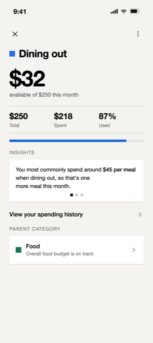
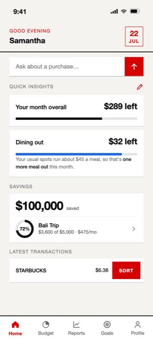
Decision support, not reporting: what's left, what it means, and whether you're on track — answered before the charts.
Core interaction
Prioritizing clarity meant showing less information
Some users wanted quick answers; others wanted detailed financial breakdowns. Showing everything to everyone served neither.
The resolution was progressive disclosure: quick-glance decision support on the home screen and more detailed analysis one interaction deeper. Users gained faster access to high-priority information, and the detailed reporting became richer for the people who actually wanted it.
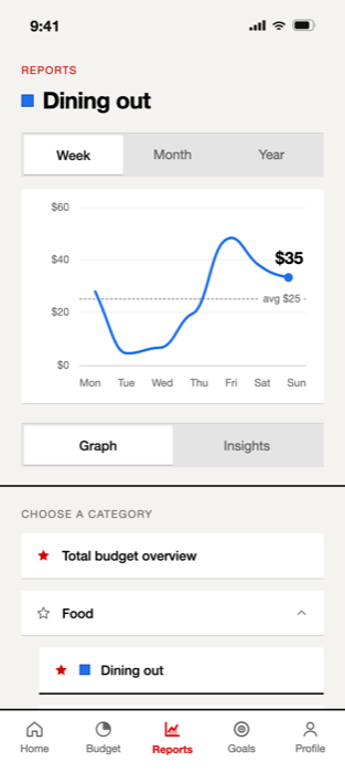
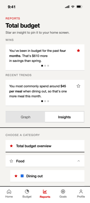
Depth on demand: full reporting lives one level down, richer than before — just no longer in the way.
Navigation
Improving navigation without hiding useful information
During testing, participants struggled to move between overall spending views and category-specific insights. My first fix — simplifying the reports screen around category navigation — made categories easier to reach but introduced a new problem: insights became harder to find.
Over three rounds of iteration the structure settled: categories moved into a persistent list, insights got their own view, and a labeled toggle connects the two. Each fix was retested rather than assumed — participants kept access to everything, just organized around how they actually moved.
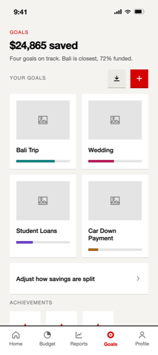
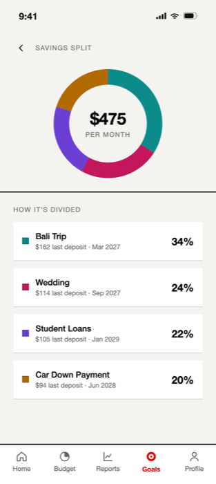
The same principle carried into goals and savings: one glanceable answer first, the machinery behind it.
Outcomes
SUS scores improved 47% over two rounds of testing
Following multiple rounds of usability testing and refinement, SUS scores improved from 55 to an average of 81. Participants completed tasks with less hesitation and required fewer prompts than in earlier rounds.
Limitations
Better information doesn't guarantee engagement
Honest finding: the concept improves decision support when users choose to check their budget — but it doesn't solve the challenge of remembering to check in the first place.
With more time, that's where I'd take Stack next: proactive budget reminders keyed to spending moments, and exploring how insights could reach users instead of waiting to be found.
Reflection
Test the fix, not just the problem
The navigation work taught me the most: my first fix created a new problem, and only retesting caught it. Every design change in Stack earned its place by surviving another round with real users.