Design system
Stack
Swiss-editorial banking. One signal red on warm paper, black ink, hairline borders, sharp corners everywhere. Color is reserved for meaning: red for actions and the current moment, category colors only for data.
Colors
Every hex below is sampled 1:1 from the lossless PNG exports of the screens — these are the exact values in the design file.
Surfaces & ink
Accent
One red. It marks actions, the active tab, the current date, and eyebrows — never decoration.
Budget categories
Data colors for the budget donut and rows. The fifth segment is ink.
Goal colors
A second, deeper family so goals never read as budgets.
Type
One family — Helvetica Neue — carried by weight and size, never by color. Sizes measured from the 2× exports (390 pt frame).
Spacing & radius
A 4 pt grid. And one deliberate rule: corner radius is 0 everywhere — cards, buttons, chips, progress bars. The sharpness is the brand.
Components
Buttons
Ask input & suggestion chips
Budget rows
Month widget
Goal tiles
Savings-split donut
Checkbox
Tab bar
Screens
The exported frames these tokens were sampled from.
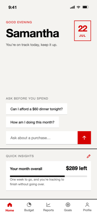
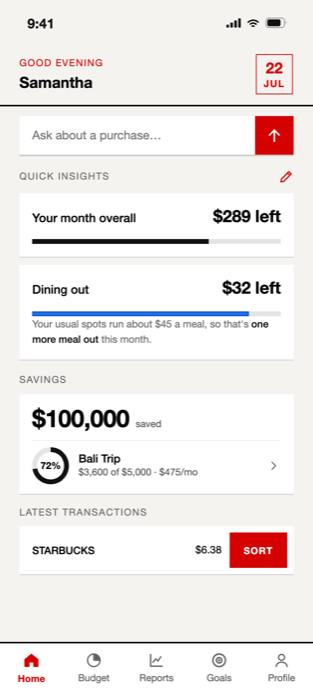
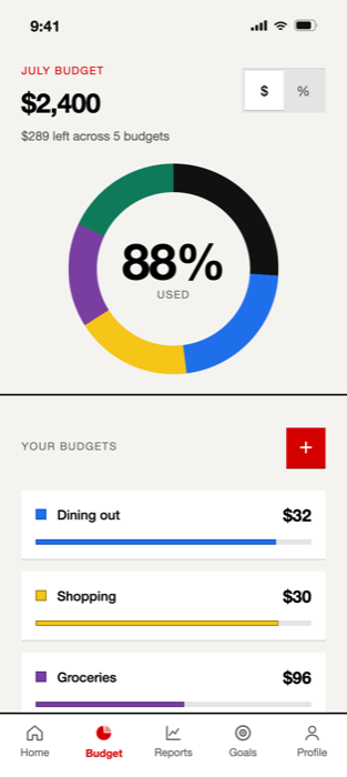
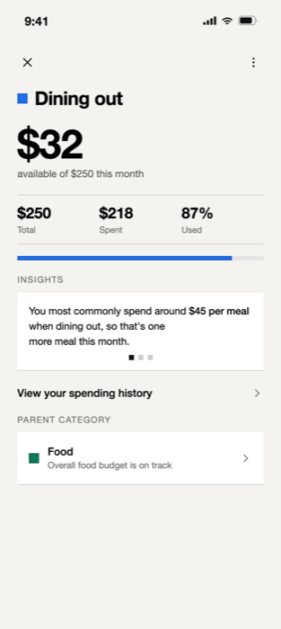
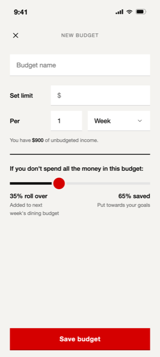
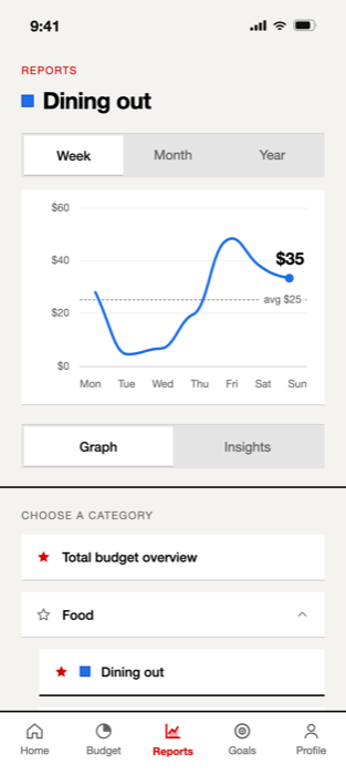
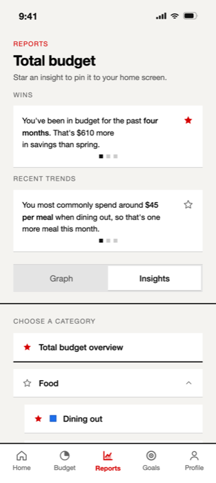
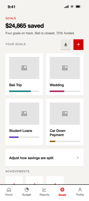
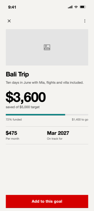
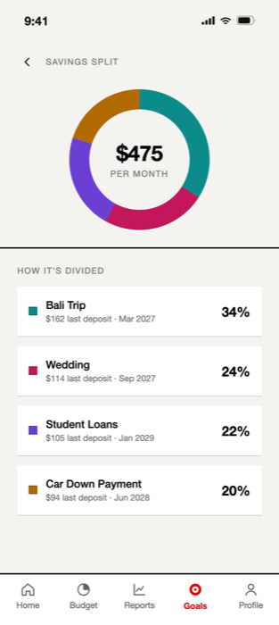
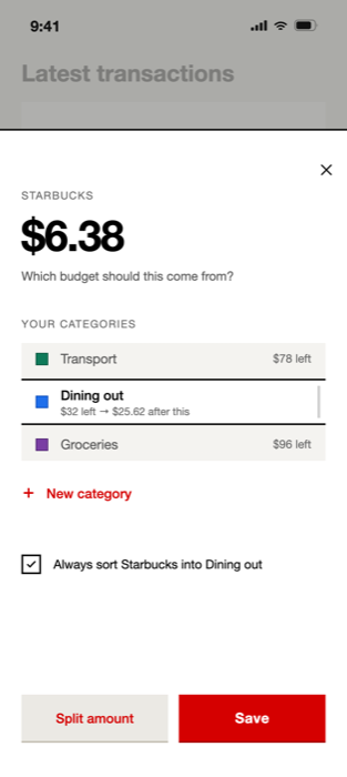
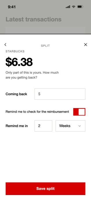
Provenance: every color was sampled pixel-for-pixel from the lossless PNG exports in
stack screens/screens-no-bezel (2× of the 390 pt frame), so the hex values are
exact. Type sizes were measured from glyph heights in the same exports (±1 px). The typeface
renders as Helvetica Neue. Components on this page are CSS reconstructions of the shipped screens.