Spotify Mix lets listeners craft real transitions between songs — matching keys, aligning BPM, shaping how tracks blend. In my survey, no one used Mix frequently; most had tried it once or twice and never went back.
I redesigned Mix inside Spotify's existing design system. Each step below starts from what Spotify ships today, then shows what I changed and why.
The problem
Smooth transitions required knowledge most listeners didn't have
Mixing well means understanding BPM compatibility, key matching, and what makes a transition sound intentional. In my survey, most respondents reported little or no familiarity with mixing terminology — and 9 of 11 who tried to learn the feature still felt confused afterward.
In moderated testing the pattern sharpened: multiple participants didn't realize Spotify even had a Smart Reorder feature moments after confidently reviewing the full interface, and participants repeatedly hunted for explanations whenever an unfamiliar concept appeared.
Spotify today
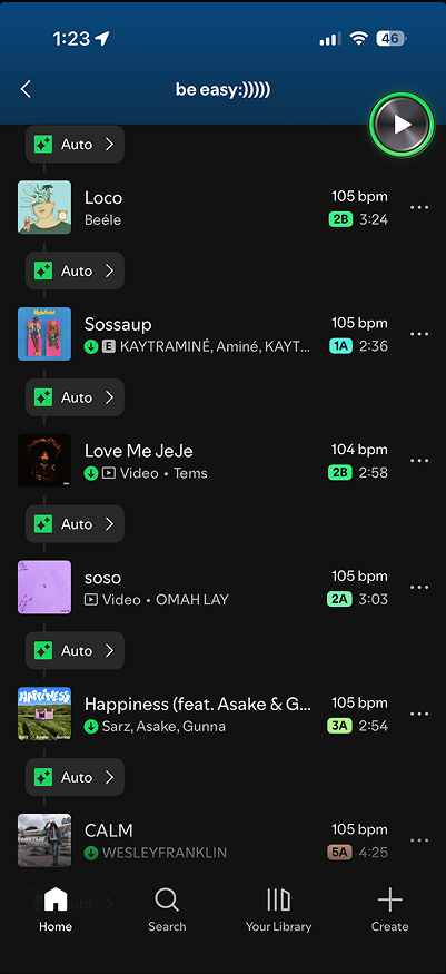
Spotify today: every row carries BPM and key data, and nothing in the app explains what any of it means.
The opportunity
Make mixing approachable without dumbing it down
The redesign focused on reducing the cognitive load of mixing: simplifying decisions, providing guidance when users needed it, and keeping the full editing power in place for people who wanted it.
Two moments carried most of the confusion — editing a transition, and understanding what the system had already done for you. Those became the redesign's spine.
Redesign

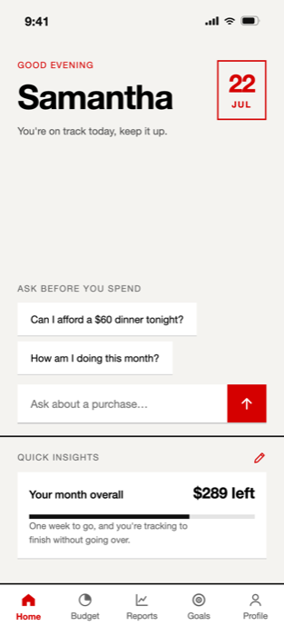
The same playlist, refocused: BPM and key data move out of the main list and appear where you actually mix.
Foundation
Simplifying transition editing
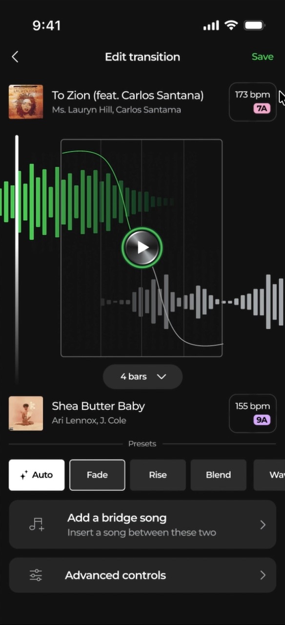
Many participants reported limited familiarity with mixing terminology, and primarily used presets when creating transitions. The redesigned editing experience keeps the dual-waveform view but promotes presets to the primary path, labels actions in plain language, and tucks advanced controls behind a deliberate step — accessible, not ambient.
Spotify today
Redesign
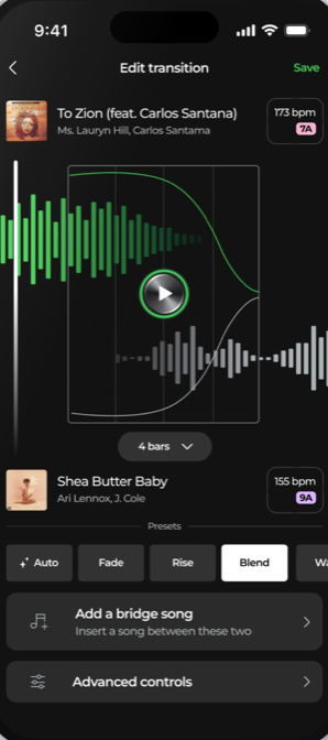
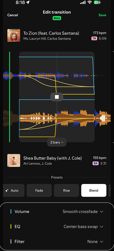
Spotify's edit screen opens onto raw waveforms and DJ controls. The redesign keeps the depth, but leads with presets and plain language — advanced controls sit one deliberate step away.
Foundation
Bringing Smart Reorder forward
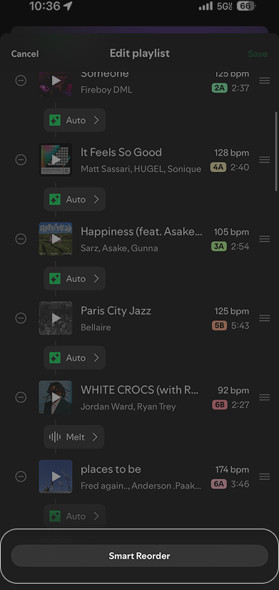
Smart Reorder — Spotify reordering your playlist for better transitions — was the feature participants loved most and found last. During testing, people simply couldn't find it, and once they did, the system's reasoning was invisible.
The redesign surfaces it as a first-class action and explains what changed and why, so the automation builds trust instead of suspicion.
Spotify today
Redesign
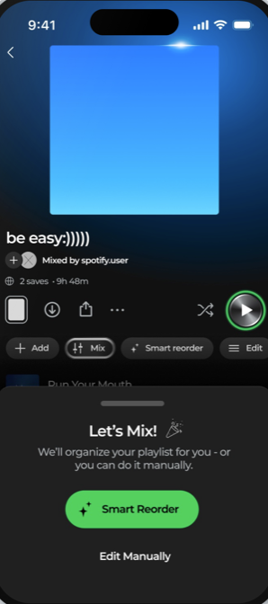
Today, Smart Reorder hides below the fold of Edit Playlist. The redesign makes it the first choice you see when you tap Mix.
Education
Tap to learn more — teaching inside the moment
Simplifying alone doesn't build understanding. Wherever a concept like BPM or key compatibility appears, it's tappable: a short contextual explanation opens right where the question occurred, then gets out of the way.
In testing, participants successfully applied BPM and key concepts after receiving these contextual explanations — knowledge that a settings-buried help page had failed to transfer.
Spotify today
Spotify has nothing to compare here — there is no educational layer today
Redesign
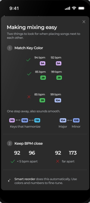
Concepts explain themselves where they appear, and one sheet frames the two rules that matter: match the key color, keep BPM close.
Problems to solutions
Fixing a rough transition, step by step
The hardest task in testing was recovering from a transition that sounded bad. One participant put it plainly: "This is not as helpful… I have to try to figure it out on my own."
The redesign flags the hard blend directly on the timeline and offers a labeled fix — including adding a bridge song when two tracks simply don't want to meet. Directly labeled actions replaced guesswork.
Spotify today
Redesign
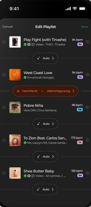
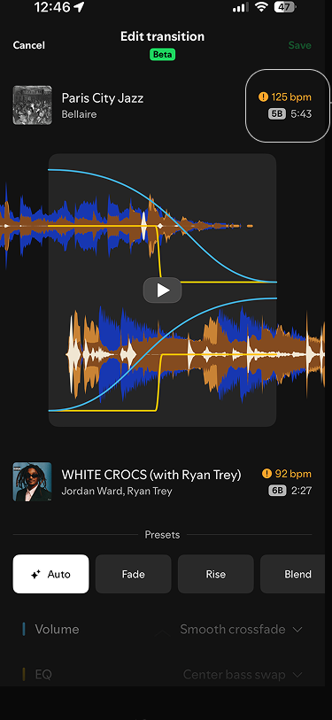
Spotify marks a clash with an orange badge and stops there. The redesign names the hard blend on the timeline and points at the fix.
Spotify today
Redesign
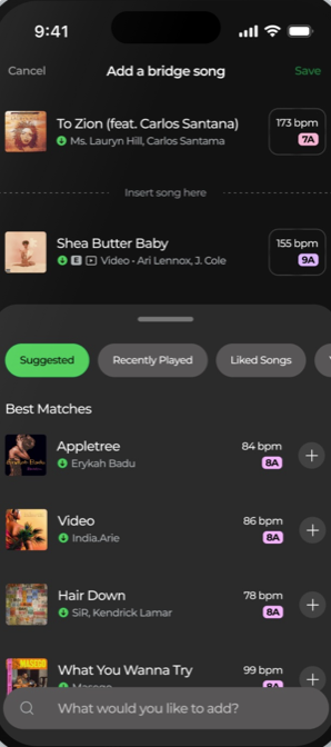
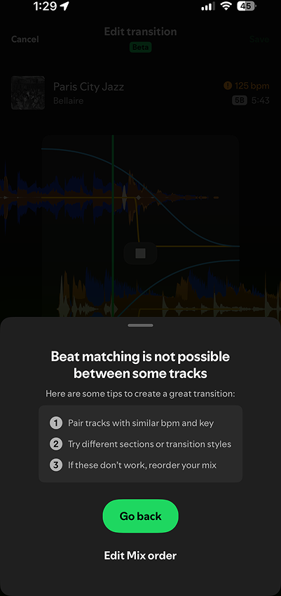
When beat matching fails today, Spotify offers general tips and a Go back button. The redesign turns the dead end into an action: add a bridge song.
Reflection
Design for different levels of involvement
Across usability testing, participants consistently rated the redesign higher than Spotify's current experience for confidence and understanding — average confidence moved from 2.6 to 3.7 out of 5, and every participant preferred the redesign.
The deeper lesson: some users wanted quick answers, others wanted detailed control. The redesign works because it serves both from the same screens — high-level clarity by default, depth one deliberate tap away.