Driftwood is an AI sales agent for demo-led outbound: it researches each prospect, builds them a working custom demo, and sends it from the founder's own account. A genuinely different product — with a website that made it sound like everything else.
The founder had run 20+ sales conversations and landed one client. The problem wasn't the product. It was a single misconception the site never corrected.
The misconception
People thought Driftwood made one demo for everyone
Prospects who saw the old site assumed Driftwood generated one generic demo of your product and blasted it out. That reading made it just another AI outbound tool — easy to dismiss in a market drowning in AI slop.
The reality is the opposite: Driftwood builds a new custom demo, tailored to every single client it contacts. That's the whole value. And it was the one message visitors consistently didn't take away.
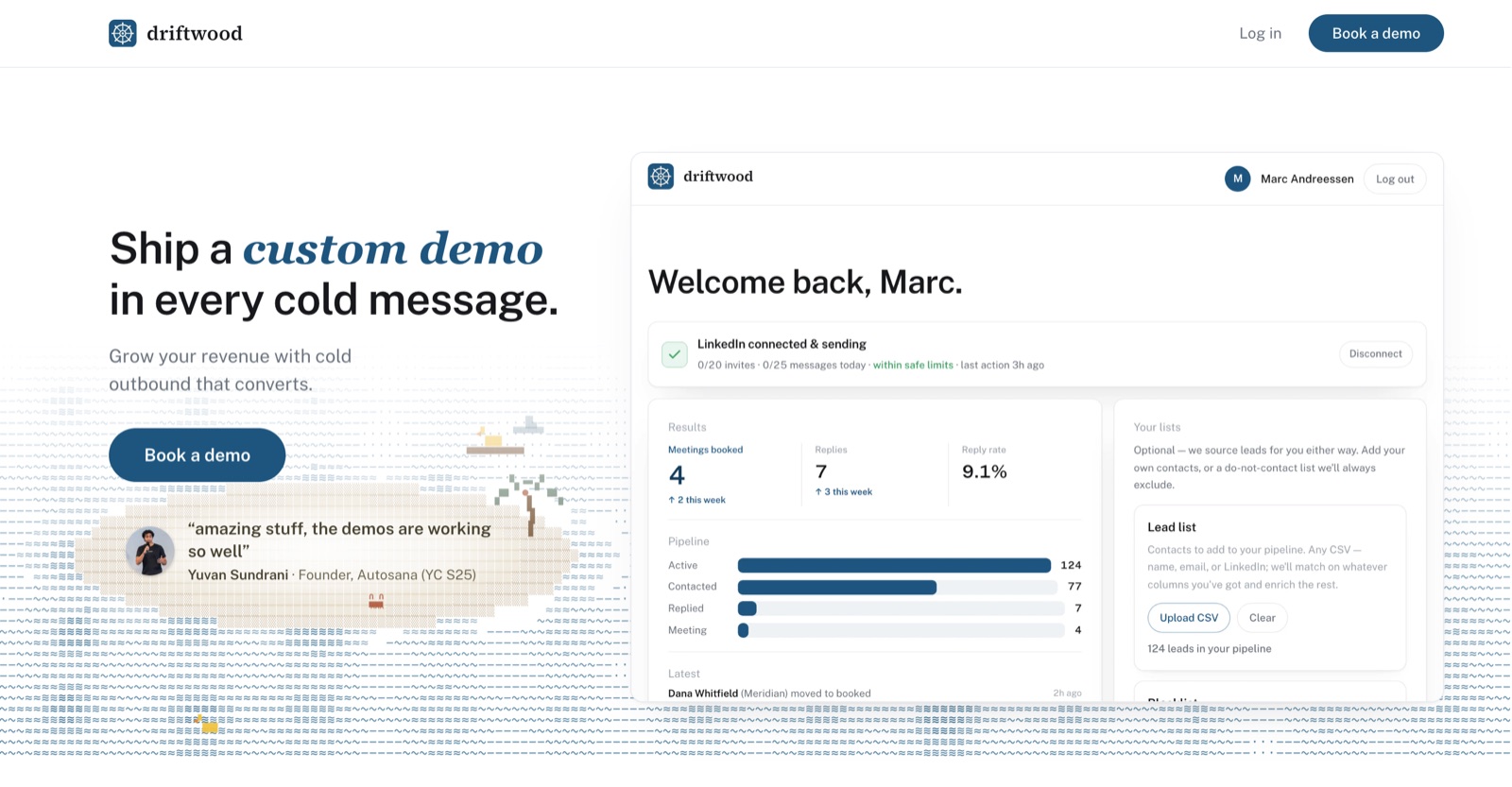
The hero it replaced. Visitors could not tell what the product actually did — and the dashboard sitting next to the headline was too busy, and too unexplained, to carry a hero.
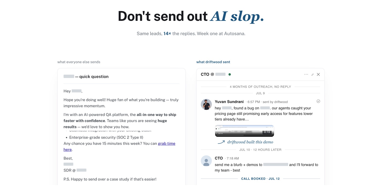
The old AI-slop comparison. The argument was right and the proof was real, but it read as raw screenshots rather than a polished product, and the value took too long to land.
Words before pixels
We tested the story on real prospects before touching the design
Instead of redesigning on instinct, we took new language and framing into in-person conversations with potential clients and watched where understanding clicked — and where it broke.
Once the framing corrected the misconception, the founder landed three more clients — before a single pixel of the new site existed. That was the green light: the message was validated with revenue, and the site's only job was to deliver it.
The pivotal moment
Show the moment the product becomes obvious
Every explanation of Driftwood eventually hits one pivotal beat: the agent has already researched the prospect and built them their own working demo. Text kept burying that moment, so I built it as motion — you watch the demo get made for a specific company, not described in the abstract.
It's the first idea the new homepage gets across, before you've read a paragraph.
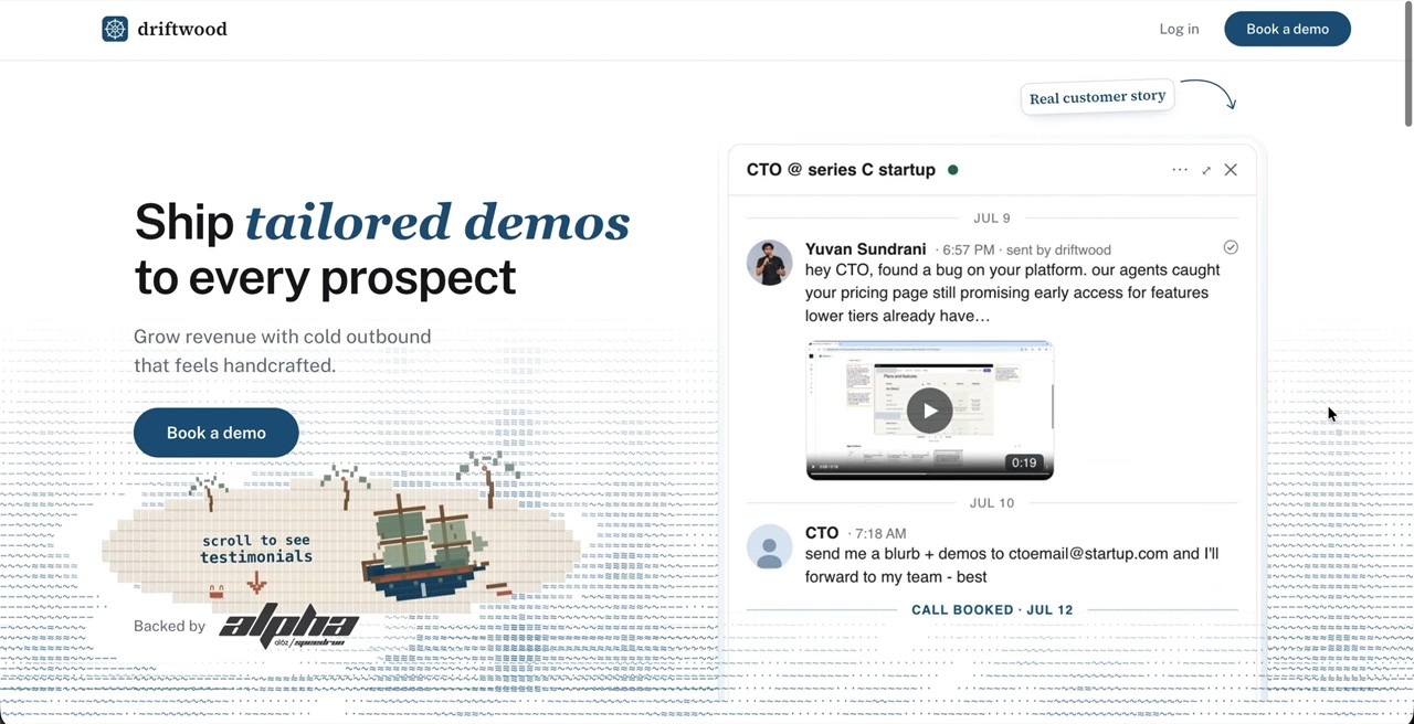
The shipped homepage. The hero shows the outcome; the pivotal moment plays out on screen instead of being explained.
Architecture
An information architecture that sells
The old page order answered the founder's questions, not the prospect's. I rebuilt the IA around the objections people actually raised in the test conversations, in the order they raised them: what is this → is it slop → prove it's custom → show me the product → let me book.
Each section earns the next scroll. Nothing on the page exists because it 'should be there' — it exists because a real prospect needed it to say yes.
Proof
Case studies you can skim — that still feel special
The degree of customization is Driftwood's proof, so I designed a case study section that shows it: real demos the agent built for real companies, presented so a visitor gets the point in seconds but can go as deep as they want.
Skimmable was the constraint. If a prospect has to read to feel the customization, the section has failed — the visual variety of the demos does the arguing.

Every card is a different demo the agent built. The variety is the argument.
The dashboard
The dashboard section, without the essay
The old 'explore the dashboard' section was word-heavy, with screenshots that had no visual focus — visitors couldn't distill the value quickly, so they skipped it.
I replaced it with an interactive, highlightable dashboard: hover a feature and it lights up with a one-line explanation. Same information, but you explore it instead of reading it. The section went from the most-skipped part of the page to the part that shows the product actually working.

Hover to highlight. Each region of the real dashboard explains itself in one line.
Reflection
Positioning is a design deliverable
The highest-leverage design work on this project happened before any interface existed: finding the one sentence prospects were getting wrong and fixing it in conversation, with evidence. The website is that sentence, made visual and shipped.
Given 18 hours end-to-end — meetings included — I coded and shipped it myself. It's live at driftwood.sh.