ROLEUX Designer
Know before you spend
Spring is a mobile-first budgeting app for first-time budgeters. Its designed to help people make smarter spending decisions before the money leaves their wallet.
TIMELINE2026
WEBSITEMobile App
METHODSCompetitive audit · Moderated testing · SUS scoring
T H E P R O B L E M
Budgeting apps assume you already know how to read your spending history and translate it into better decisions

Only 27% of Americans can correctly answer basic financial literacy questions.¹ Yet every budgeting app on the market is built as if users already understand what the data means and what to do next. The result: 38% of Americans spent more than they planned last month², and finance apps retain just 4.2% of users after 30 days.³
A competitive audit of seven leading apps confirmed the same pattern — every home screen is built around reviewing what already happened. Your spending last month. Your budget categories. Your net worth. All useful after the fact, but none of it helps you answer the question that actually matters: can I afford this right now?
Spring was designed to answer that question before the money leaves your wallet.
1. FINRA National Financial Literacy Survey, 2024. Financial Industry Regulatory Authority. finra.org2. Ramsey Solutions. The State of Personal Finance Q4 2025. ramseysolutions.com3. MoEngage. App Retention and Churn Report, cited in Twinr, June 2025. twinr.devW H O T H I S I S F O R
Two people. Two different reasons they struggle with their finances.

Maya
26 · Marketing · Atlanta
"I've downloaded three budgeting apps. I always get through setup and then just stop opening it."
She sees her spending data but doesn't know what to do with it. She needs the app to tell her what action to take — not just show her numbers.

James
31 · Teacher · Seattle
"I check my bank account but I never know if what I'm seeing is good or bad."
He has limited time and limited patience. If the app doesn't give him a clear answer in the first 30 seconds, he's gone.
D E S I G N D E C I S I O N S
So how do we design a budgeting app around future decisions rather than past reflection?
I decided to tackle this with the home screen. It needs to be a place that you can grab what you need to reference quickly and leave.
The next question is, how do we distill useful information quickly and succinctly on a mobile screen.
My solve was to design this app around a useful widget that allowed you to preemptively plan to stay in budget that flexes with your life.
U S E R J O U R N E Y
Friend: Hey! Do you want to go out to eat this week?
User: Potentially, give me a sec
I really don’t want to go over budget but I really want to hang out with my friend.
Ok, the end of the month is coming and I have a little money left. Let me suggest one of the mom and pops!
Friend: Can we try that new place? I know we’ve been itching to go
User: You’re right! We might have to do it next month though but let me see what I can do
Ok, I have $32 left this month but how am I doing in general?
Ok! My food category is in budget. If I plan my grocery meals carefully, it’s ok if I’m a little over this month because my over all budget will be good.
To design this I started with the home screen widgets.
→
User: Ok let’s do it!
C H A L L E N G E 0 1 : D E S I G N I N G T H E H O M E S C R E E N W I D G E T S
The home screen should answer: can I afford this?
Standing in the store. Getting the dinner invitation. That's when people need information, and that's when every existing app makes you dig for it.
T H E I S S U E
When I first wireframed the home screen, I realize that it’s giving you the status of EVERYTHING.
If there’s so much, is it really easy to quickly read and stay actionable?
How is this different than a Reports tab or a Budget tab?
Why is this page valuable?
I talked to users. People don’t want everything. They want focus— a few categories that they personally struggle with, surfaced immediately.
One participant put it directly:
"I just want to know if I can afford this. I don't want to think."
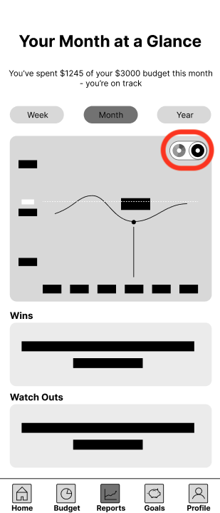
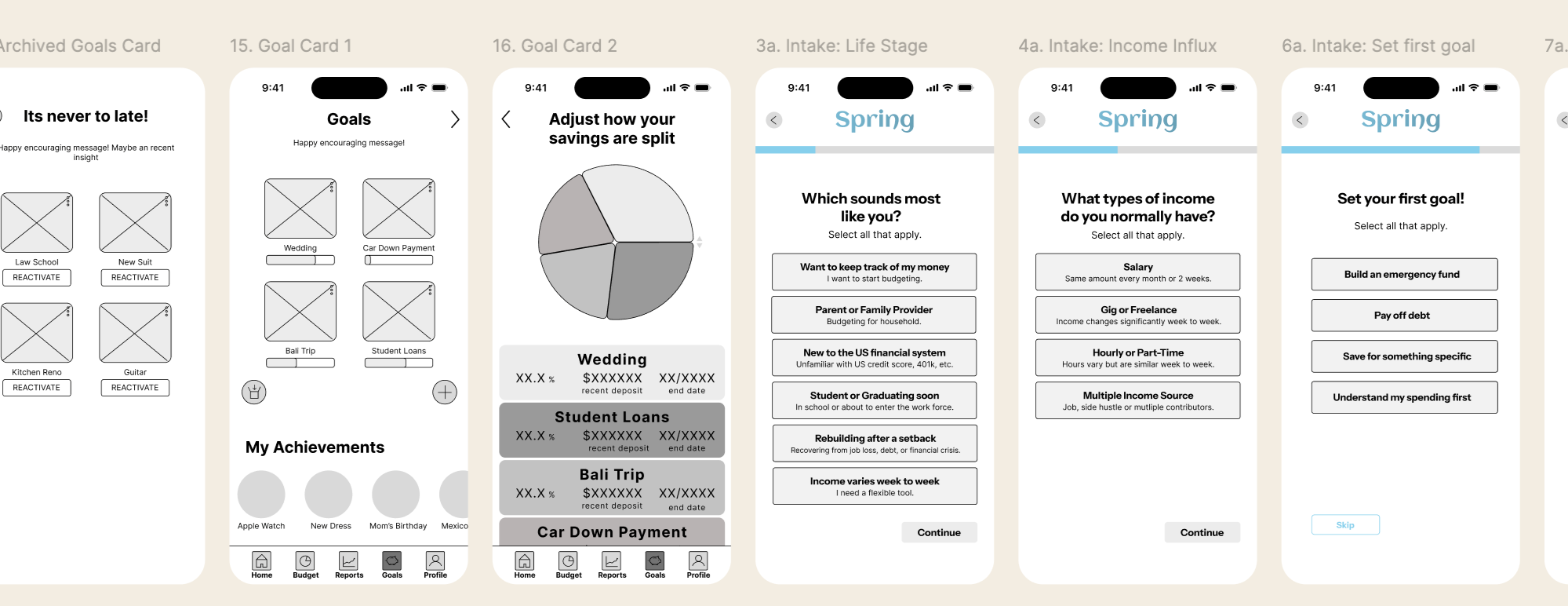
New Home Screen widget design
W H A T P R O V E D I T W O R K E D
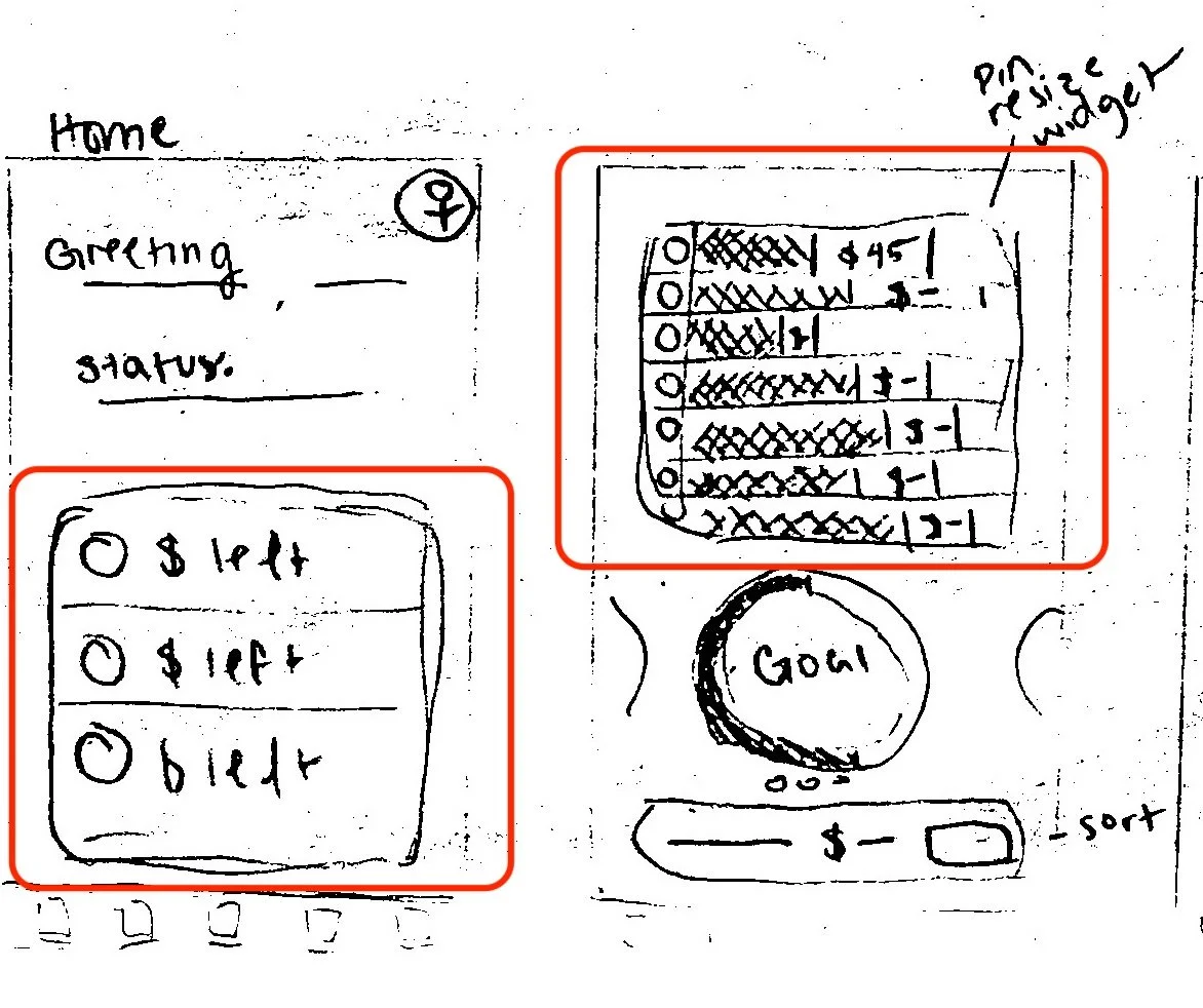
First attempt at the Home Screen widget
T H E S O L V E
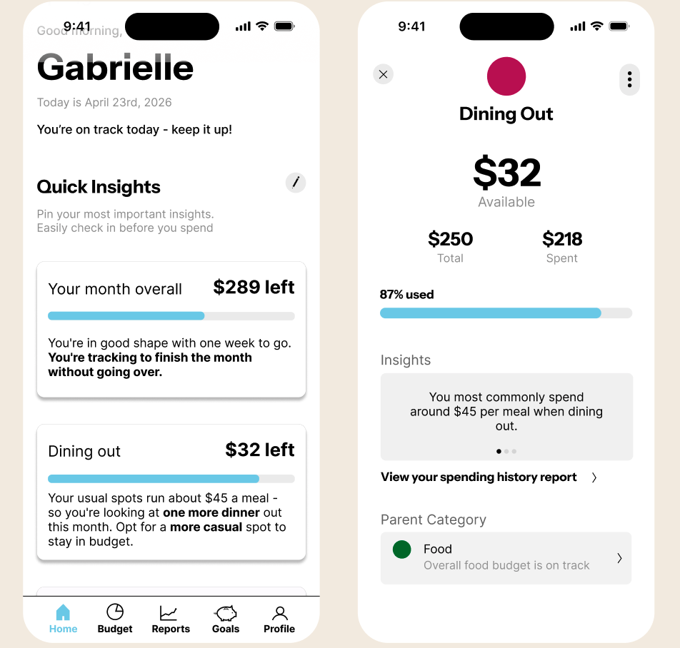
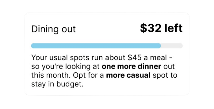
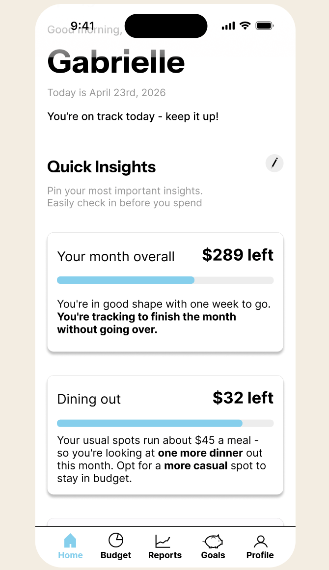
So, I added customizable insight widgets, showing remaining budget in the categories the user flags as important, with one actionable sentence of context.
Just "$32 left in dining out." isn’t helpful without context.
But "$32 left— your usual spots run about $45 a meal. One more dinner this month."
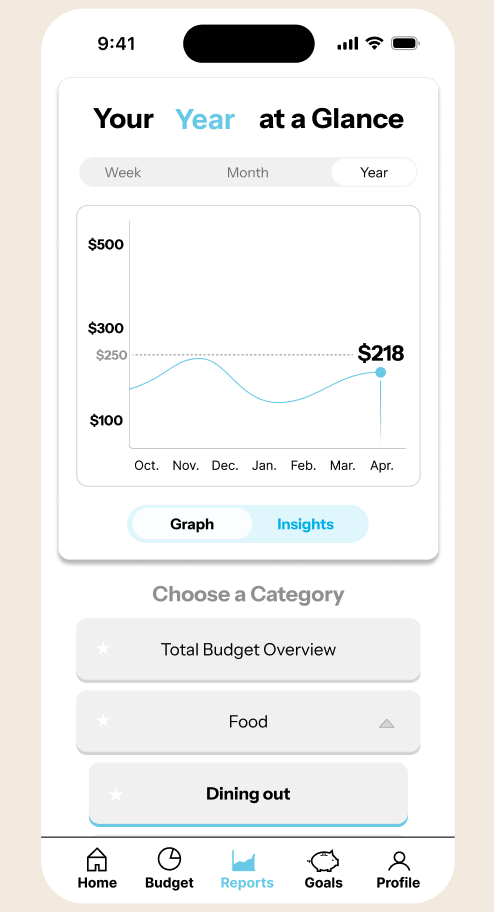
Now when you view widgets on the Home Screen, you’ll see an “Overall budget” widget comes first, followed by up to categories of personal concern.
But what if you still want to learn more about the widget’s budget category?
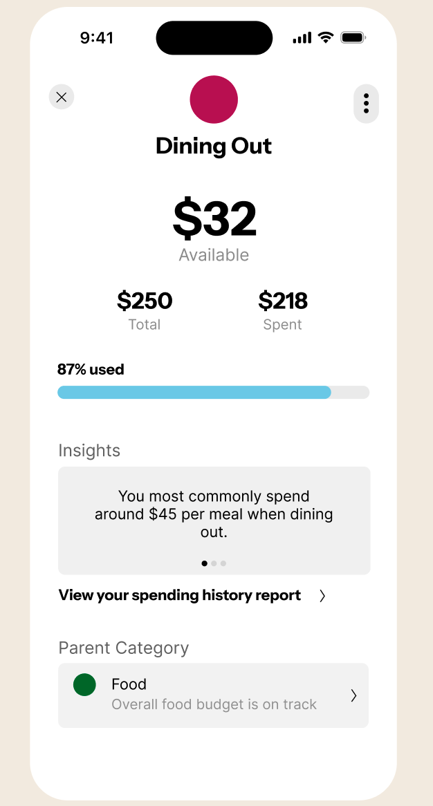
Tap the widget and you’ll open its expanded budget card for more details on the category’s status.
A lot of learning to budget is understanding our patterns. But it’s also avoiding guilt. When we reach close to the end of a budget, we need to see if there is something we do often or is it ok we go over just this once.
This app gets people to check their habits before they spend. It provides a space for rational reasoning because the guilt of going over budget might cause some to be less consistent.
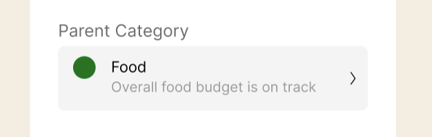
Budgets also don’t have to be rigid. Having parent categories gives users a greater content to operate under. They serve as mini check points for user to make careful decisions so that they feel in control.
"this is useful" "this is helpful" "I could just consult this"
What participants said during usability testing, participants reached the home screen unprompted:
Budget card for dining out
M O R E D E S I G N D E C I S I O N S
Two key problems I iterated through. Here's the thinking.
Each decision came from something a real user said or did. Design solutions are backed by testing.
C H A L L E N G E 0 2 : M A K I N G T H E R E P O R T S T A B E A S Y T O N A V I G A T E
If a user can't find a feature, the feature doesn't exist.
During the first round of testing, a participant was on the reports tab. I asked her to navigate from the overall spending view to a specific category.
She said "I'm sorry, I can't find it".
T H E T H I N KI N G
The toggle that switched views was an unlabeled icon in the corner of the graph — two pie chart icons, one whole and one sectioned. It communicated nothing to someone seeing it for the first time.

FIRST ATTEMPT AT HOME SCREEN WIDGETS
Overall view to section view icon. Once switched to section view, the list of categories populated under the graph.
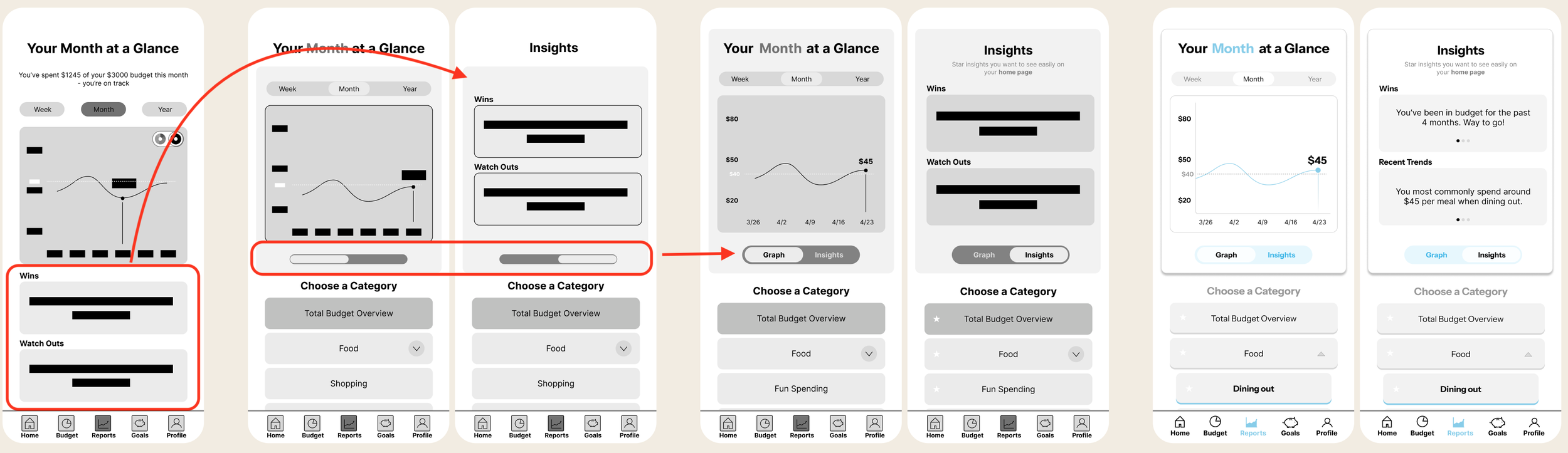
First I restructured the page — moving categories to a list below the graph so users could always see and easily select
But that created a new problem: the category list now is where the insights used to be.
So I added a slider to give insights their own space.what they wanted to view.
W H A T P R O V E D I T W O R K E D
Labels added and iteration tested
R O U N D 0 1
P A R T I C I P A N T 0 1
55
Then I remembered what might have also tripped the participant up — the original toggle had no label.
I tested this version with two participants. And found that there was no friction to find the insights or categories
Color added
T H R E E I T E R A T I O N S
Original
Wins and watch outs moved + toggle deleted
Post interview SUS scores increase across rounds by over 47% after iteration
R O U N D 0 2
P A R T I C I P A N T 0 2
90
Once the interaction was clear, I moved to a third iteration and added color to make the active state visually obvious at a glance.
72
R O U N D 0 2
P A R T I C I P A N T 0 2
C H A L L E N G E 0 3 :
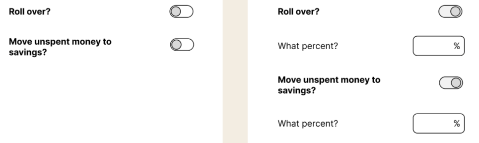
Rolling over vs saving
During testing, a participant said: "Wouldn't whatever you don't roll over automatically go to savings? You probably only need one of these."
True— the screen was asking the same question twice.
T H E T H I N K I N G
In testing, users stated that they liked the roll-over feature. I knew I had to keep it.
However in testing I noticed that, during the onboarding flow some users wanted to prioritize saving while others just wanted to stay in budget. I realized that rolling over might appeal to someone who might like to spend more, but spend responsibly; yet, saving might appeal to those who want to reach their other goals faster.
To accommodate both types of user motivators, both words needed to be present for them to understand where they money could be going.
I also realized that it doesn’ t need to be either or — roll over or save. They can meet themselves somewhere in the middle.
That’s why I created a slider.
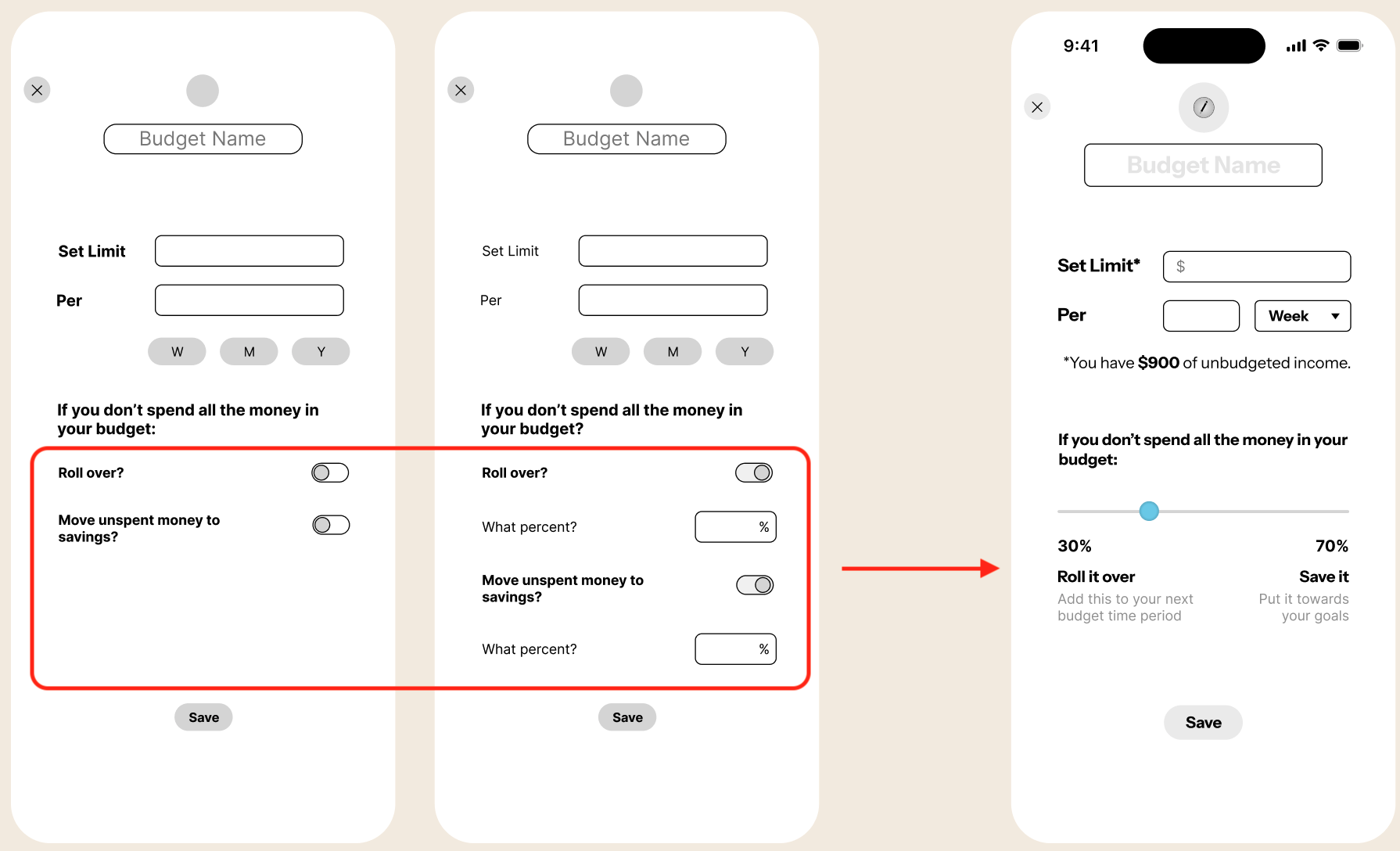
A slider solved it. Whatever you're not rolling over is automatically being saved, and vice versa. Users have a more intuitive visual of where they money is going.
During this same iteration I noticed users had no reference point for how much they had left to actually budget when setting a limit.
I added a disclaimer showing that figure.
O N E I T E R A T I O N
First attempt
W H A T P R O V E D I T W O R K E D
Old roll over flows
Latest iteration
When a participant saw the slider they said "that's cool — I can choose how much to roll over versus save" and moved on without confusion. When she saw the unbudgeted income disclaimer they said "oh that's a helpful reference, I won't overspend." No friction means it worked.
Key Learnings
What I’d do to improve as a designer for the future.
I made a user flow diagram for this project but in the future I would make a product flow diagram as well. Understand what was happening to the money in this would’ve really helped me set up features like adding a new budget
1.
2.
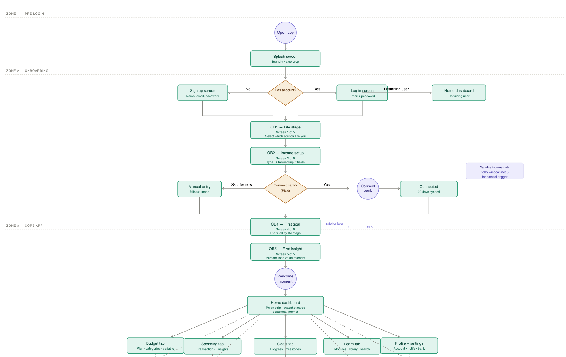
Userflow diagram
Dont put everything on a screen at once.
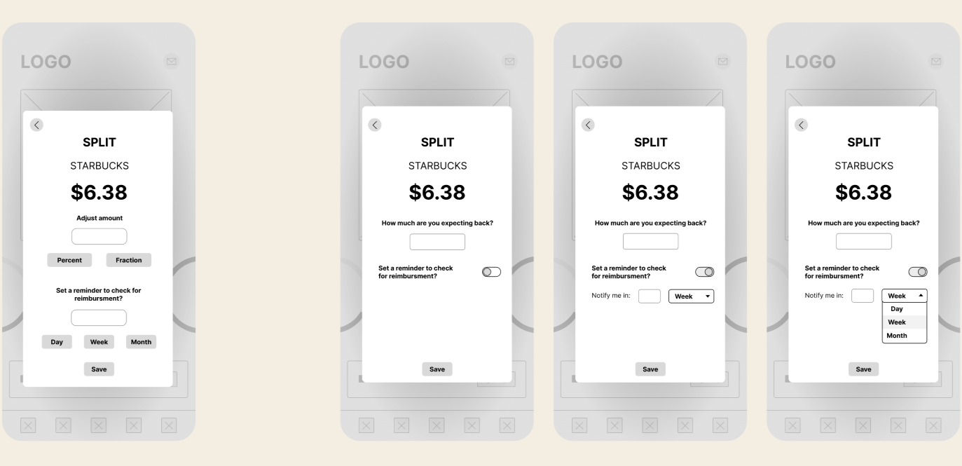
If you’re expecting money back— maybe you covered someone — you can set up an alarm for how much you’re expect and for when you should check.
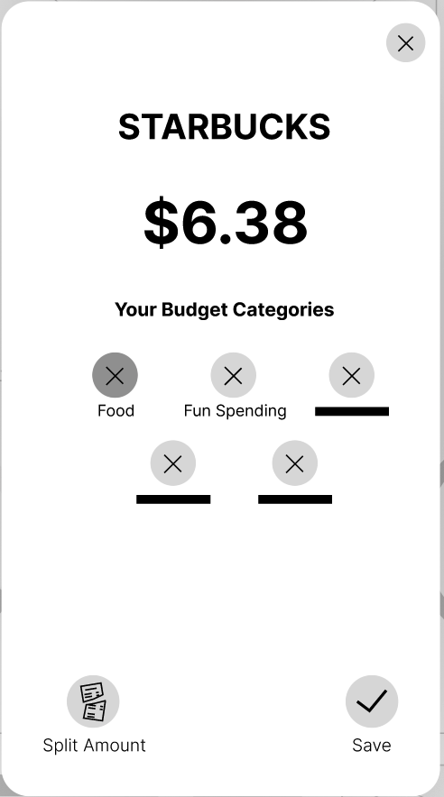
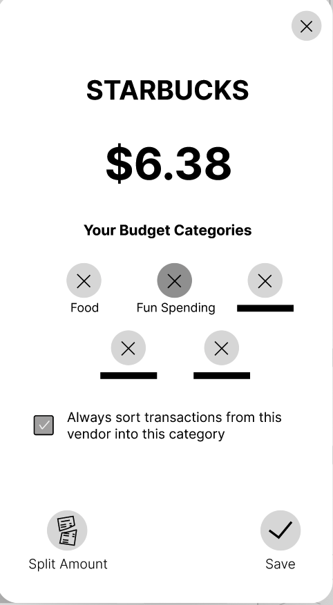
While sorting, if you change the auto categorized category, then it prompts you if maintain this change for the vendor in the future.
With more time, here’s what I do with Spring
W H A T W O R K E D
Setback recovery flow A warm re-entry experience for users who fall off track. No guilt, no missed streak counter. Just a neutral summary and a choice to reset or continue.
A Learn tab Eight financial literacy modules, each under five minutes. Plain English, swipeable cards, with a "try it" action that connects directly to the user's real data. Competitors didn’t have infrastructure to teach user about their finances.
Next Project
( Budgeting App )
PRODUCT DESIGN
The Credibility Gap
Explore how physicians make referral decisions through interviews and qual + quant research, to write clear, effective messaging for a oncology clinic- Atlantic Health.